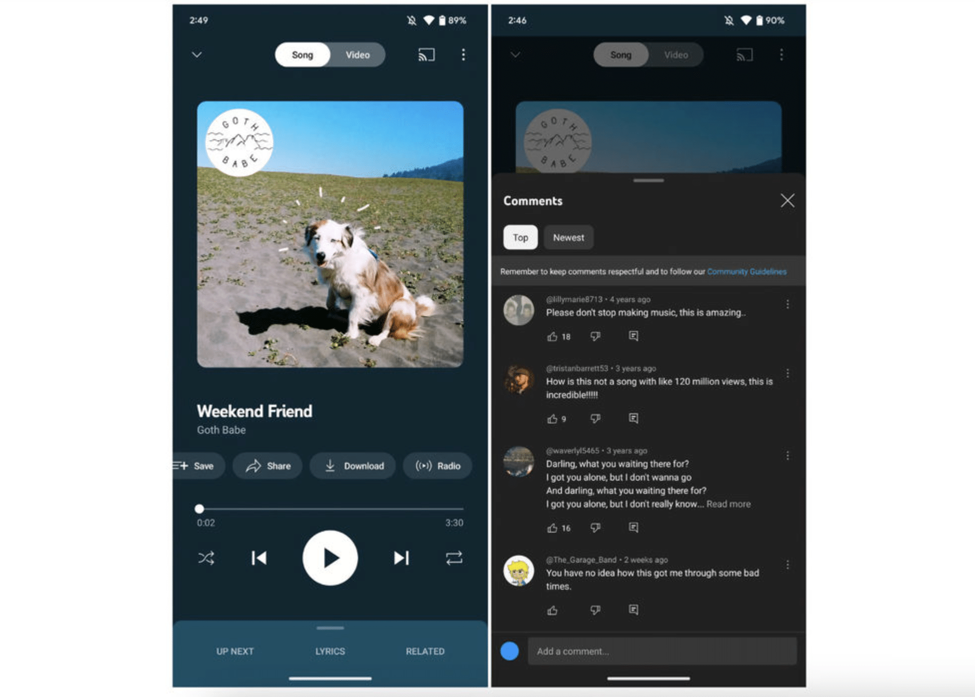
9to5Google reports that YouTube has redesigned the “Now Playing” interface of the YouTube Music app, with both a new look and new functionality. Among other changes, they’ve added a commenting feature, allowing YouTube Music users to comment on the currently playing song and also read what other users have to say about it.
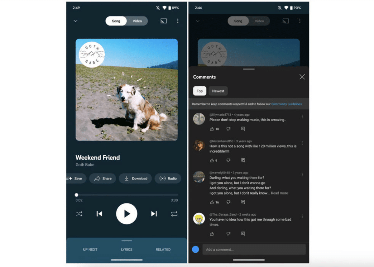
Other interface changes include moving some buttons up into a scrollable row just below the playing video clip. The new version of the YouTube Music app has started rolling out now, but it doesn’t appear to have been released to everyone just yet.
In the image above, you can see an example of what the comment section looks like in YouTube Music.

