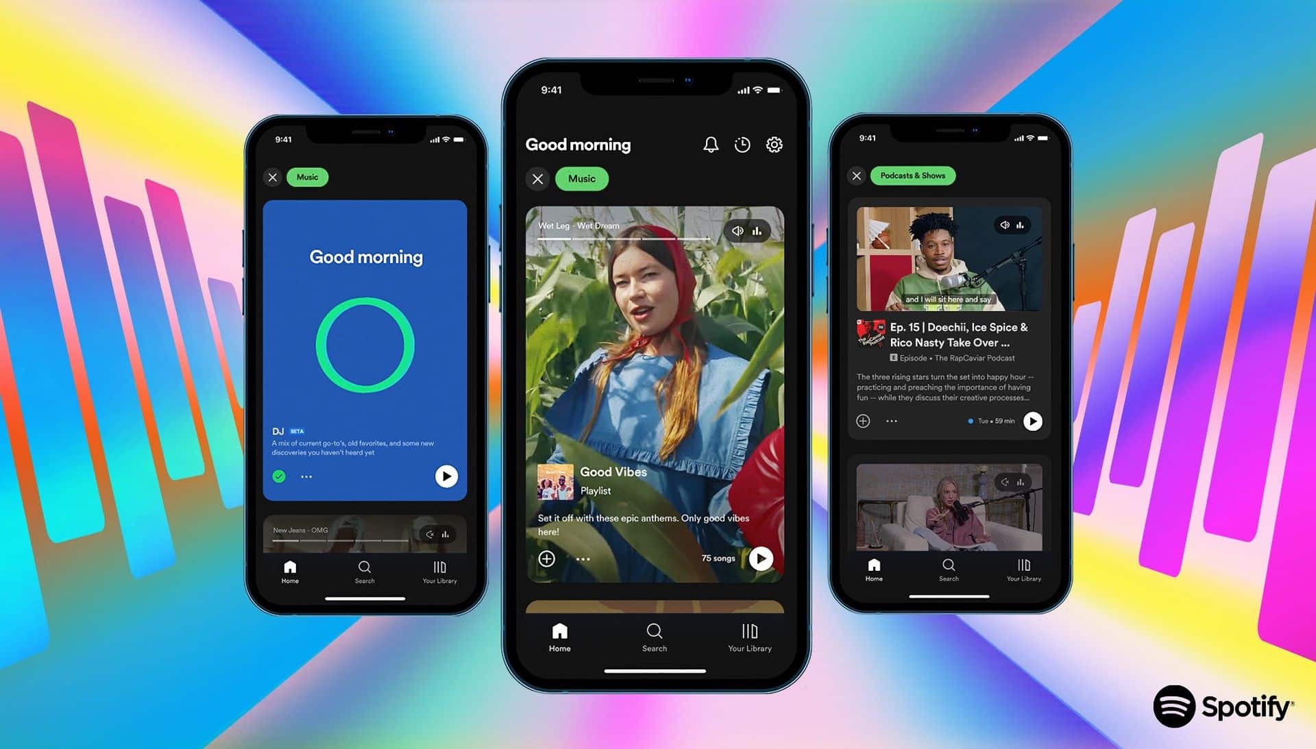
It’s been 15 years since Spotify launched, and back then it was only available on computers. Now, it’s all about mobile first, which isn’t entirely unexpected. Today, Spotify unveiled what they call the “New Spotify.” If you want to simplify things and be a little mean, you could say that they are trying to become TikTok for artists, podcasters, and authors.
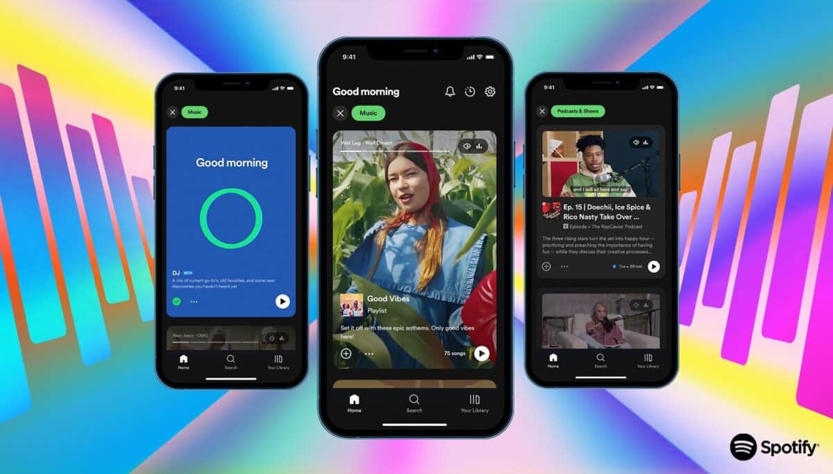
On your home screen, you have a lot of album covers, and album covers are best seen in stacks in record stores. Digitally, they’re honestly not that exciting, and Spotify wants to change that. They’re creating a feed where artists can post videos, song excerpts, or podcast snippets. It’s similar to content trailers so that you can quickly and pleasantly browse through what’s new among what you like or should like. Spotify has a lot of data there, so the idea is good.
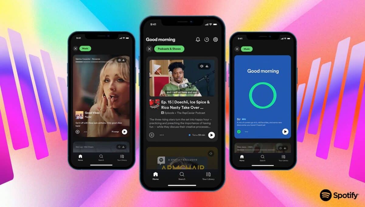
Spotify’s problem is that TikTok has become extremely important for musicians today. Songs that circulate there quickly become popular, and the music that people recommend there helps you find new music. It’s a wild mix of regular people, people with taste, and artists who recommend music.
Now, Spotify wants to make its product a bit sexier and regain some of this, but the problem is that everything in Spotify’s presentation today was incredibly polished, boring, and produced by record labels. The features will be available to a few artists at first, then a few more. Personally, I don’t want to know what record labels or playlist curators want me to listen to. I want tips from people I like and from my friends. It feels like Spotify is missing the mark here.
As usual, I could be wrong. Perhaps that feed will be very exciting, or maybe it will be just right. We’ll see when it’s released soon.
Below is a short video showing Spotify’s interface over the years.

