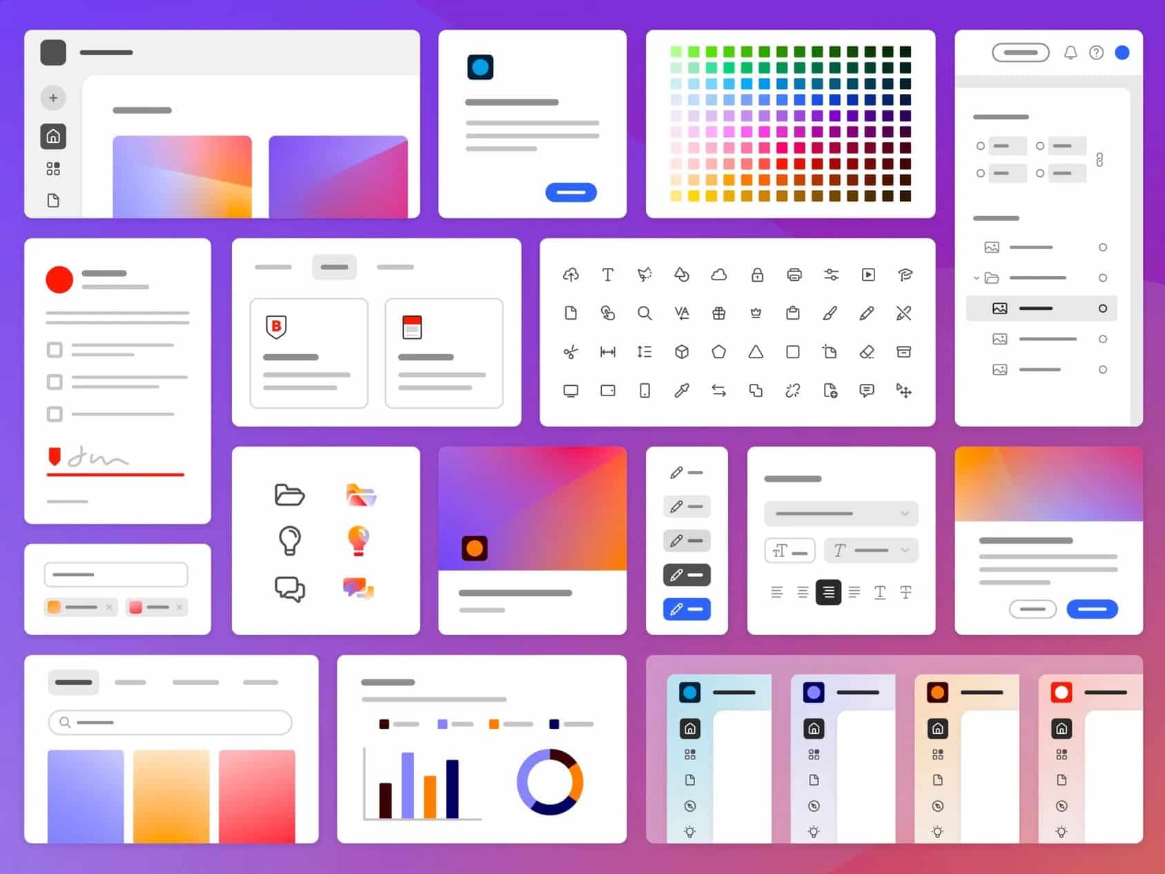
Adobe’s interface foundation in their products is known as Spectrum. Created over ten years ago, Spectrum has seen significant changes since its inception. At that time, the concept of a design system was barely known, Adobe products were not used on mobile devices, and the target audience for Adobe’s products was much narrower.
Users used to spend their entire day with Adobe’s software, but now there are also users who engage with them briefly, occasionally. This led to the development of Spectrum 2.
Adobe itself states that over 100 people have been involved in the process. They also emphasize that using Spectrum 2 should feel familiar, accessible, and inclusive, ensuring it is not only functional but also enjoyable.
Adobe mentions that the interface will be customizable by the user. This includes options to switch to a dark mode, adjust contrast, and control the spacing between elements. Below, you can see how Photoshop and Acrobat might look in their web forms.

